Spend Dashboards User Guide
The Spend Dashboard is a range of dedicated ‘Qlik’ technology-based dashboards, containing filterable report widgets and analysis tools. They can operate in two modes, ‘Analysis’ and ‘Story’. Story mode allows the creation of report snapshots or whole dashboard page sheets to create a presentation in PowerPoint format, which can be exported and shared. The ‘Pin’, ‘Share’ and ‘Save’ features work consistently in all dashboards.
Dashboard Access
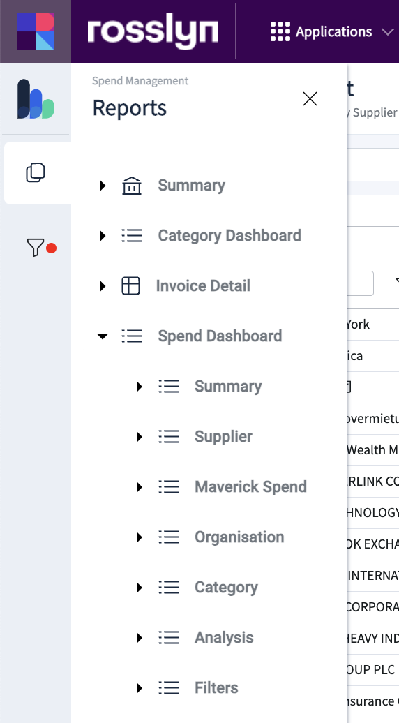
To access the Spend Dashboards and other reports within the Rosslyn Platform, use the main navigation option menu found on the left side of the screen.
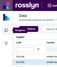
Click on ‘Spend Dashboard’ to expand the menu.
Summary – Main Overview
This Dashboard provides an overall spend performance synopsis via summary statistics, key performance indicators, spend/invoices over time and global supplier view.
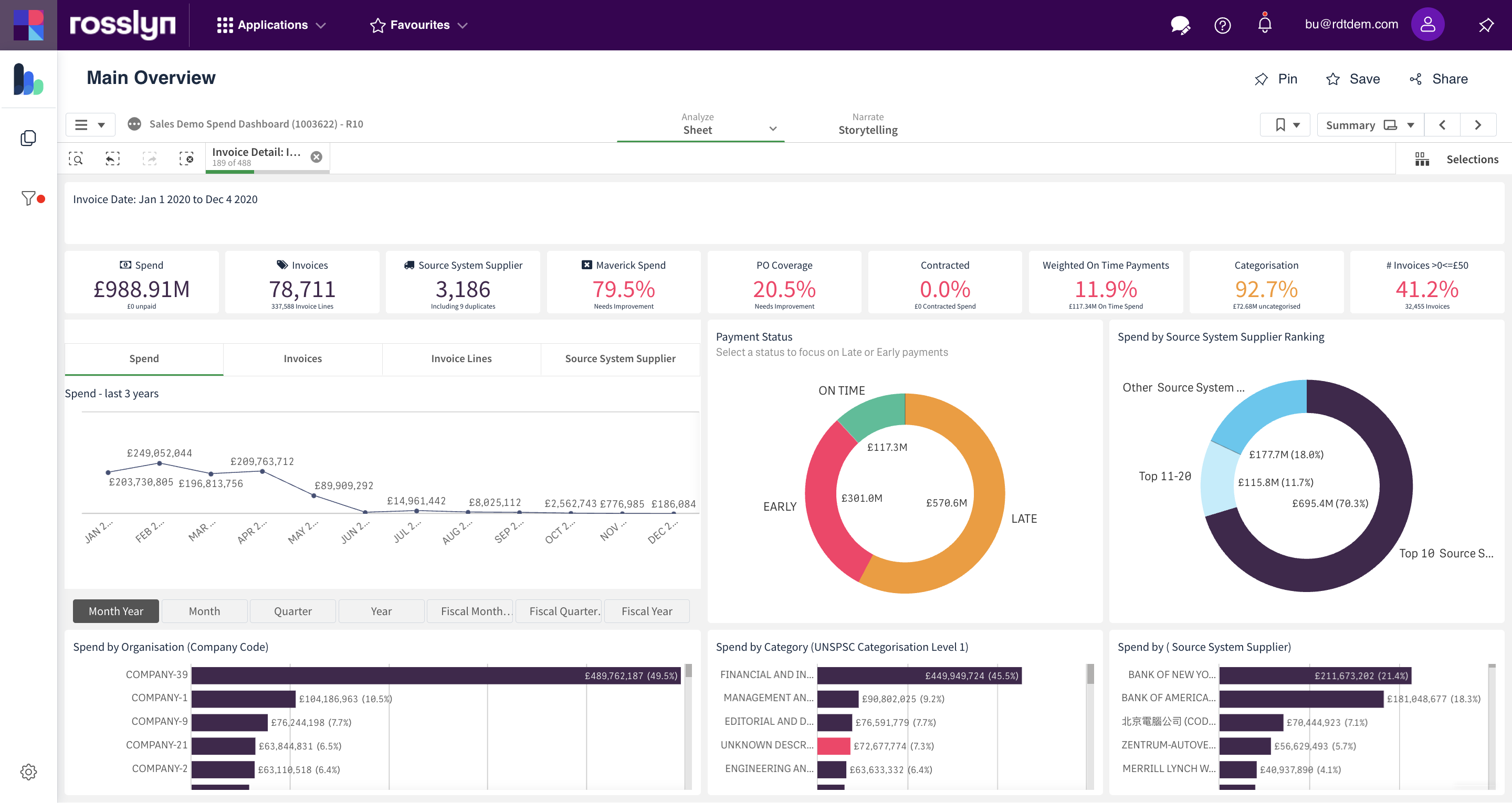
This data criteria and date range can be changed using the filters on the left of the screen.
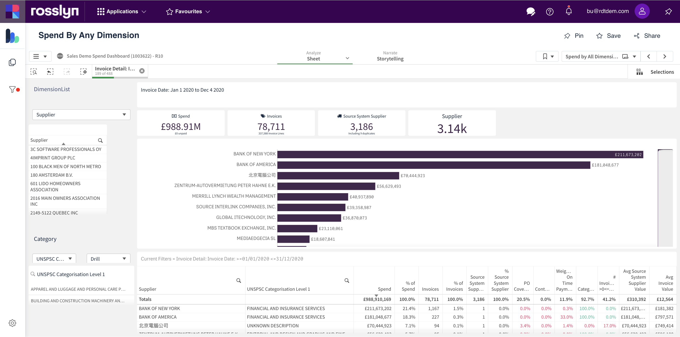
Summary – Spend By Any Dimension
This dashboard summarises spend data by dimension. Use the ‘Dimension List’ and hierarchal ‘Category’ dropdown menus to focus the results.
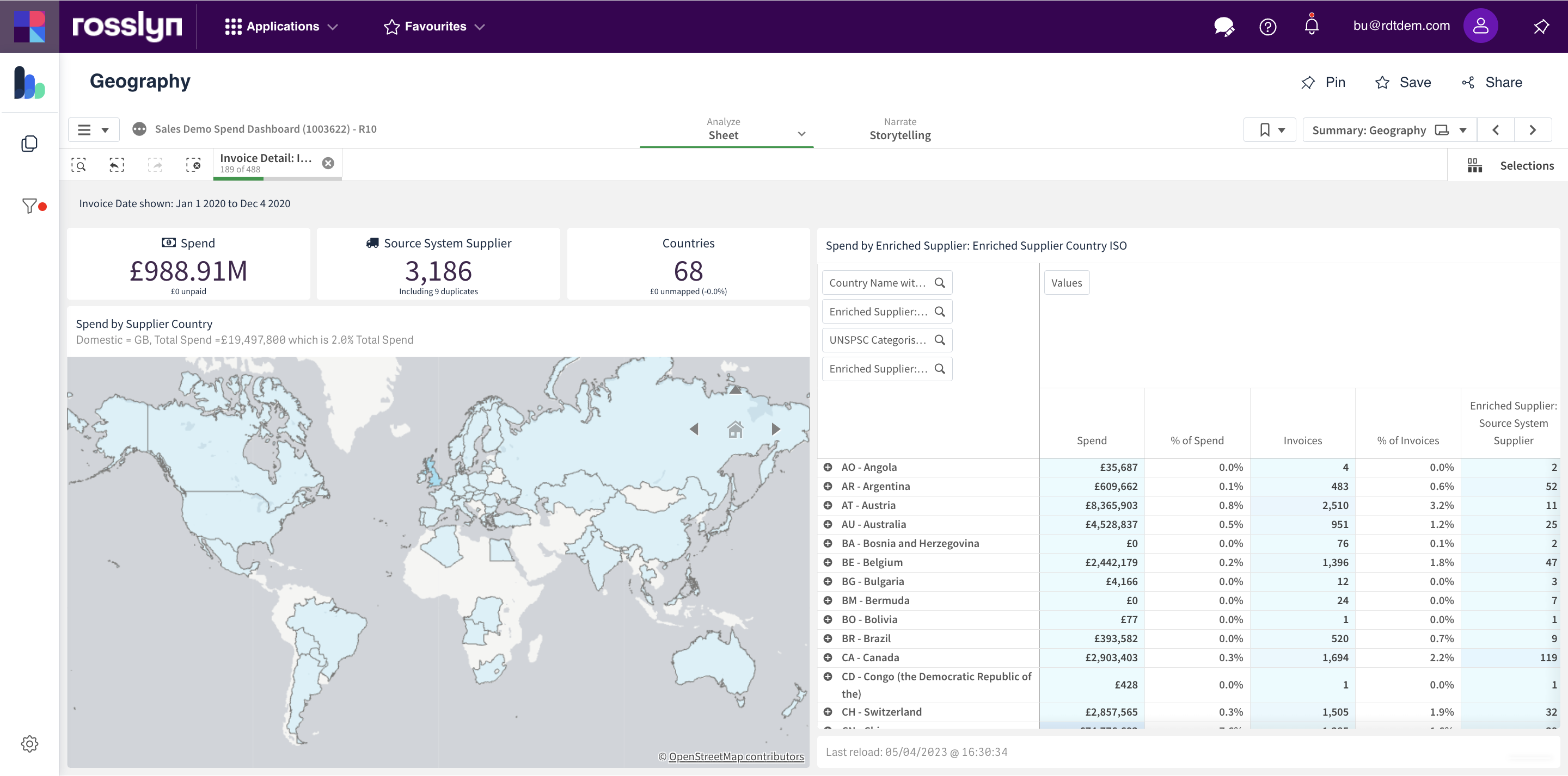
Supplier – Geography
The map can be used to select a Country of focus. Selections will be applied to show only data for the specific Country and will be applied across the reports. Filters can be removed or adjusted if required. Filter(s) can be applied using the ‘Country ISO’ table. Search tools are available to further refine the results.
Supplier – New/Unused Suppliers
This Dashboard highlights New and Unused Suppliers, and the period of activity/inactivity. Use this report to determine the point in time a supplier becomes active, inactive, or unused. This could assist with supplier consolidation.
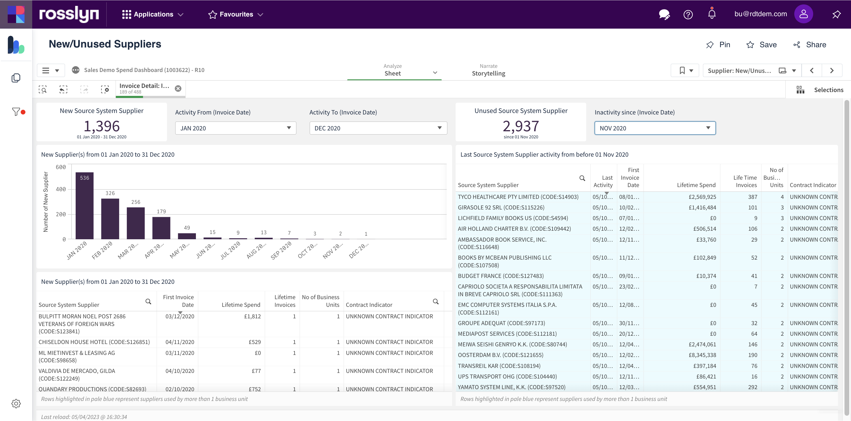
The results are split into two halves. The left side focuses on New and Active Suppliers. The right side focuses on Unused Suppliers. Activity and Inactivity dates can be set via the date dropdowns.
Maverick – Purchase Orders and Contracts
For details on this dashboard, click on the button below to go to the dedicated user guide.
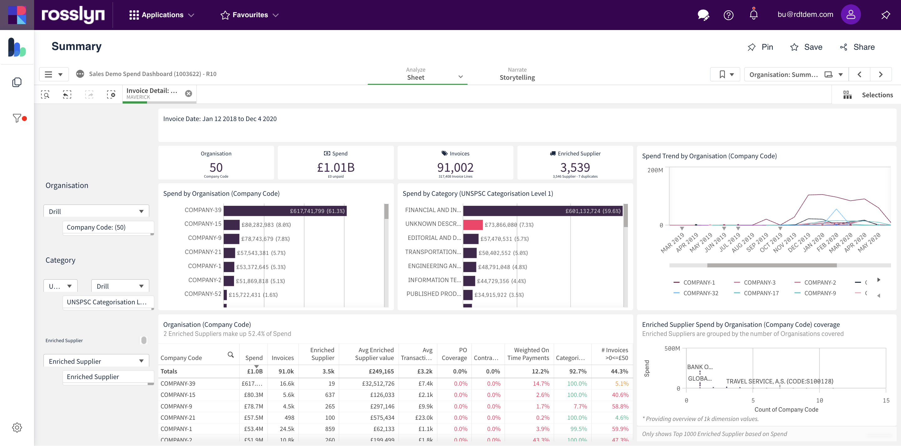
Organisation – Summary
This Dashboard provides an overview of Organisation Level spend by selected Organisational Division, Category or Supplier. Dropdown menus are available to change any of these three Dimensions for analysis.
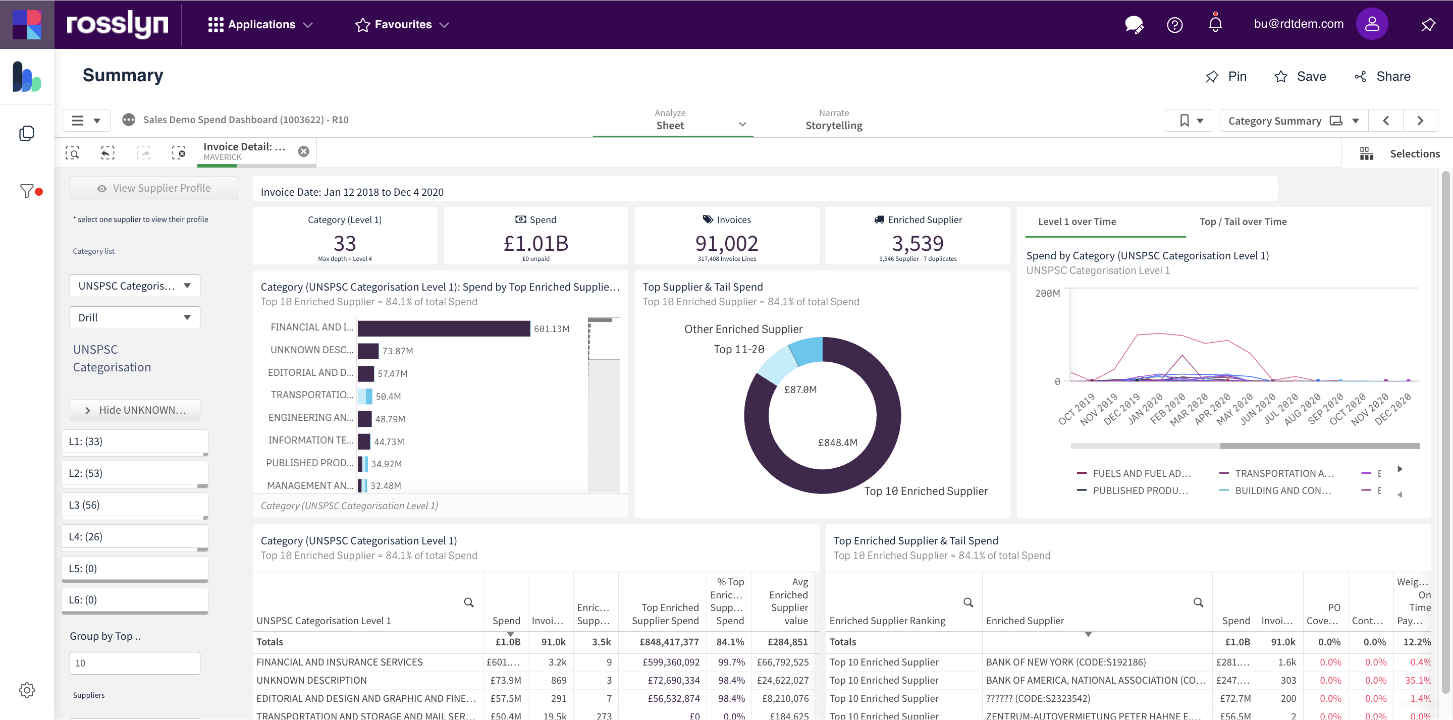
Category – Summary
A category dashboard that contains a selection of useful charts for analysis. Category levels can be selected using the selection menus found at the left of the screen.
Analysis – Comparative Analysis
The Comparative Analysis dashboard has been designed to aid you in completing a detailed comparative analysis of spend over time, using a range of dimensions, measures, and metrics.
Use this dashboard to gain insights into the spend activity through comparison and gain a better understanding using controlled variables.
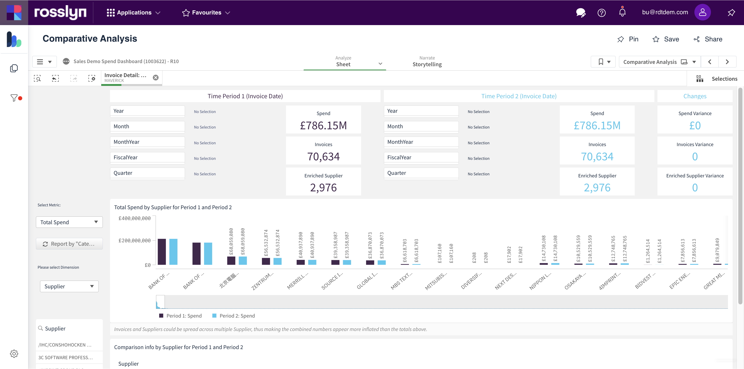
Use this dashboard to analyse spend is across time periods and time selections Period 1 and Period 2.
Metric groupings can be selected by using the dropdown menus for the comparative analysis of spend data.
Options:
- Total Spend/# of Invoices/# of Suppliers
- Dimensions
Tip: Once you have generated a basic comparative analysis report based on your chosen dimensions and periods of time, toggle between Metrics to gain various visualisation report results.
Analysis – Tail Spend
For details on this dashboard, click on the button below to go to the dedicated user guide.